Fonts with Feeling
How Typography Changes the Mood of Your Brand
When you think about your brand, you probably picture your logo, colours, or maybe even your website layout. But there’s one design element that quietly shapes how people feel about your brand before they’ve even read a word: typography.
Fonts aren’t just letters on a screen – they’re voices. They whisper, shout, sing, or soothe, depending on the style you choose.
Fonts Set the Mood
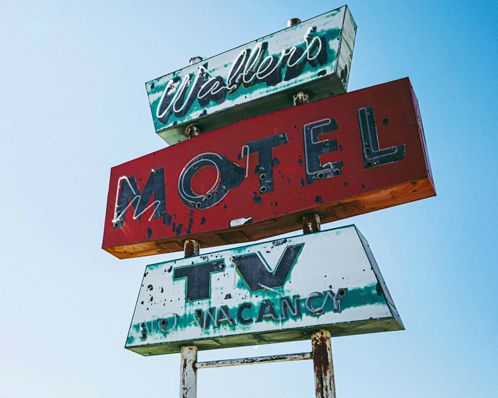
Imagine walking into a coffee shop. The sign outside is written in a bold, blocky font – it feels strong, industrial, maybe even a little edgy. Now picture the same sign in a flowing script – suddenly, it feels cosy, artisanal, and warm. Same word, completely different vibe.
Typography works the same way for your brand. The font you choose tells your audience what kind of experience to expect.
Common Font “Personalities"
| Font Style | Mood/Feeling | Where It Works Best |
|---|---|---|
| Serif (e.g. Times New Roman, Garamond) | Trustworthy, traditional, elegant | Law firms, luxury brands, editorial |
| Sans Serif (e.g. Helvetica, Arial) | Modern, clean, approachable | Tech companies, startups, lifestyle brands |
| Script (e.g. Brush Script, Pacifico) | Personal, creative, romantic | Boutiques, wedding services, artisanal products |
| Display/Decorative | Bold, playful, attention-grabbing | Event posters, youth brands, campaigns |
| Monospace (e.g. Courier) | Technical, retro, precise | Coding, tech nostalgia, niche creative projects |


Why It Matters?
- First Impressions Count: People form an opinion about your brand in seconds. Fonts help set that tone instantly.
- Consistency Builds Trust: Using the same typography across your website, social media, and print creates a cohesive identity.
- Emotion Drives Connection: Fonts can make your brand feel friendly, serious, playful, or luxurious — and that emotional connection is what makes people remember you.
Tips for Choosing the Right Font
- Match the Mood: Think about your brand’s personality. Are you bold and disruptive, or calm and reassuring?
- Keep It Readable: Fancy fonts are fun, but if people can’t read your message, it’s wasted.
- Limit Your Palette: Stick to two or three fonts max — one for headings, one for body text, and maybe one accent.
- Test It Out: See how your fonts look on different devices and in different sizes.
Closing Thought
Typography is like the soundtrack to your brand. The right font choice can make your message sing, while the wrong one can leave your audience confused. So next time you’re designing a post, a flyer, or even your website, ask yourself: what do I want people to feel when they read this?
At Zoeke, we believe design isn’t just about looking good – it’s about creating a mood that sticks.
Fonts with Feeling Quick Read
How Typography Changes the Mood of Your Brand
Fonts aren’t just letters on a screen – they’re voices. They whisper, shout, sing, or soothe, depending on the style you choose.
Fonts Set the Mood
Imagine walking into a coffee shop. The sign outside is written in a bold, blocky font – it feels strong, industrial, maybe even a little edgy. Now picture the same sign in a flowing script – suddenly, it feels cosy, artisanal, and warm. Same word, completely different vibe.
Typography works the same way for your brand. The font you choose tells your audience what kind of experience to expect.
Common Font “Personalities”
Here’s a quick guide to how different font families can shift the mood of your brand:
| Font Style | Mood/Feeling | Where It Works Best |
|---|---|---|
| Serif (e.g. Times New Roman, Garamond) | Trustworthy, traditional, elegant | Law firms, luxury brands, editorial |
| Sans Serif (e.g. Helvetica, Arial) | Modern, clean, approachable | Tech companies, startups, lifestyle brands |
| Script (e.g. Brush Script, Pacifico) | Personal, creative, romantic | Boutiques, wedding services, artisanal products |
| Display/Decorative | Bold, playful, attention-grabbing | Event posters, youth brands, campaigns |
| Monospace (e.g. Courier) | Technical, retro, precise | Coding, tech nostalgia, niche creative projects |
Why It Matters?
> First Impressions Count: People form an opinion about your brand in seconds. Fonts help set that tone instantly.
> Consistency Builds Trust: Using the same typography across your website, social media, and print creates a cohesive identity.
> Emotion Drives Connection: Fonts can make your brand feel friendly, serious, playful, or luxurious — and that emotional connection is what makes people remember you.
Tips for Choosing the Right Font
> Match the Mood: Think about your brand’s personality. Are you bold and disruptive, or calm and reassuring?
> Keep It Readable: Fancy fonts are fun, but if people can’t read your message, it’s wasted.
> Limit Your Palette: Stick to two or three fonts max — one for headings, one for body text, and maybe one accent.
> Test It Out: See how your fonts look on different devices and in different sizes.
Closing Thought
Typography is like the soundtrack to your brand. The right font choice can make your message sing, while the wrong one can leave your audience confused. So next time you’re designing a post, a flyer, or even your website, ask yourself: what do I want people to feel when they read this?
At Zoeke, we believe design isn’t just about looking good – it’s about creating a mood that sticks.