When you think of iconic brands, Nike, Starbucks, Apple, the first thing that often comes to mind is their logo. A logo is more than just a pretty design; it’s the face of a brand, the visual shorthand that communicates identity, values, and personality in a single glance. But not all logos are created equal. In fact, there are several distinct types of logos, each with its own strengths, applications, and impact. Understanding these types can help businesses choose the right style to represent their brand.
1. Wordmark Logos
Wordmarks are logos built entirely from text, usually the brand’s name, styled in a distinctive font. Think of Google, Coca-Cola, or Disney.
Strengths: Clean, simple, and easy to recognize.
Best for: Brands with short, memorable names that want their name itself to be the star.

2. Lettermark Logos
Lettermarks use initials or abbreviations instead of full names. IBM, CNN, and HBO are classic examples.
Strengths: Great for long or complex names, making them easier to remember.
Best for: Companies with lengthy names or those already known by their initials.

3. Brandmark / Pictorial Logos
These logos rely on a symbol or icon to represent the brand. Apple’s bitten apple and Twitter’s bird are textbook examples.
Strengths: Instantly recognizable and versatile across languages.
Best for: Brands that want a strong, universal symbol that transcends text.

4. Abstract Logos
Abstract logos use geometric shapes or unique designs that don’t directly represent real-world objects. Examples include Nike’s swoosh or Adidas’ three stripes.
Strengths: Highly distinctive and flexible in meaning.
Best for: Brands wanting a modern, unique identity that can evolve over time.

5. Emblem Logos
Emblems combine text and imagery within a single shape—often circular or shield-like. Think Starbucks, Harley-Davidson, or NFL team logos.
Strengths: Traditional, authoritative, and detailed.
Best for: Institutions, schools, government bodies, or brands that want a classic, established feel.

6. Mascot Logos
Mascots are illustrated characters that embody the brand’s personality. KFC’s Colonel Sanders or the Michelin Man are famous examples.
Strengths: Fun, approachable, and great for storytelling.
Best for: Family-friendly brands, sports teams, or companies that want to build emotional connections.

7. Combination Logos
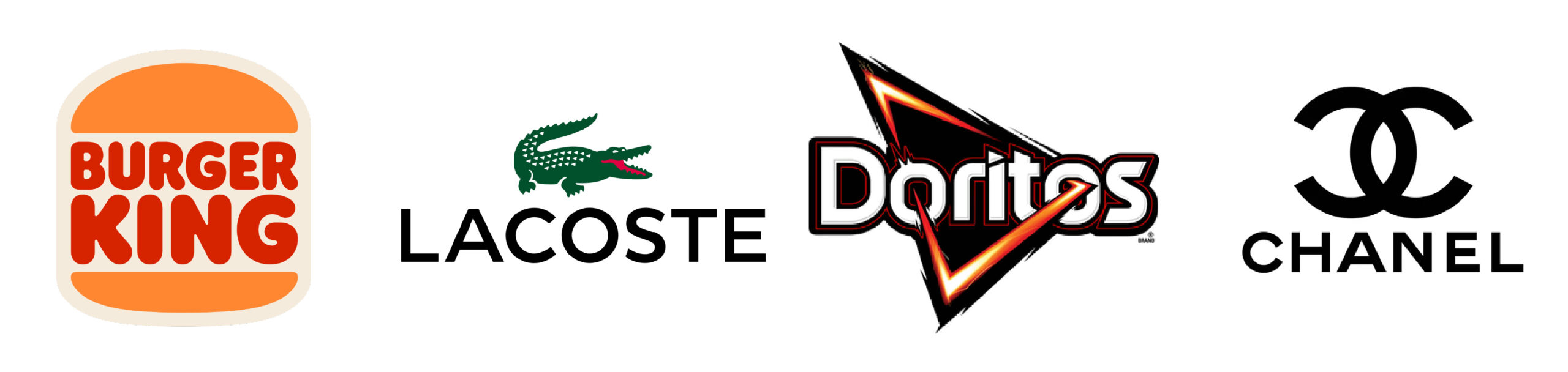
Combination marks blend text with a symbol, giving flexibility in how the logo is used. Adidas, Burger King, and Lacoste all use this style.
Strengths: Versatile, memorable, and adaptable across platforms.
Best for: Brands that want both name recognition and a strong visual symbol.
Why Choosing the Right Logo Matters
Your logo is often the first impression customers have of your brand. A well-chosen logo:
- Builds trust and credibility.
- Creates instant recognition.
- Communicates values and personality.
- Differentiates you from competitors.
When designing or choosing a logo, consider your brand’s mission, audience, and industry. A law firm might lean toward a wordmark or emblem for professionalism, while a children’s brand might thrive with a mascot.
Ultimately, the best logo isn’t just beautiful, it’s strategic. It tells your story in a way that sticks.